A spreadsheet packed with only numbers makes it almost impossible to spot trends and make sense of your data at a glance. Now, import all the data into a single sheet and create interactive cross-platform reports in Google sheets. And instantly, you make a difference.
Whether it is your site traffic, sales from your stores, or new followers on your social media sites, uniting and making sense of your data at different places can mean a lot for your business. Bringing this data together and creating meaningful marketing reporting dashboards automatically turns your numbers into clear, actionable insights.
And so, with a spreadsheet and some integrations, you can learn how to quickly pull data from multiple sources to help you create unified cross-platform dashboards for all your reporting needs.
So, let’s dive right in!
Five Steps to Create Cross-Platform Reports in Google Sheets
Follow the five steps below to build custom, cross-platform reports for your marketing campaigns in Google Sheets.
Step #1: Decide what to include in your reports
A marketing dashboard can include data from one or more sources, and each dashboard will use different data sources to tell its story. Thus, the first step to creating a cross-platform report in Google Sheets is to determine the data that matters most for your report.
Do you want to track new followers on your social media channels? How about the number of incoming customer support tickets? Where is the data that you need to use coming from? Once you list all the data sources you will use to build your dashboards, it’s to start determining the metrics that matter the most for your reports.
And with these metrics, every company values different metrics for accessing their growth. So, your team may have several KPIs to measure your company’s performance, like sign-up rates, month-over-month growth, traffic, conversion rates, etc. Thus, you must decide which of those you must include in your reports.
For example, if you want to measure new followers on our social media marketing channels, you must consider metrics like follower growth for the specific period you need to measure. That is, you must consider how performance is measured in your company to help you determine the metrics to track.
Read more: Top 10 Most Important KPIs for Digital Marketers
Step #2: Get your data on Google Sheets
Getting your data to Google Sheets is easy. Once you’ve determined all the data sources and the metrics you need to track in Google Sheets, the next step is to bring your data to the platform to create a report.
Google Sheets has several pre-built add-ons to help you pull your data from multiple sources. You can explore the Google Sheets Extension Store to find them. These extensions are great, and we will explain how you can use our own to bring your marketing data to your Google Sheets for reporting.
Dataslayer Google Sheets Extension will help you to pull your digital marketing from your favorite social media or PPC advertising channels. So, with a few clicks, you can easily and automatically import, update, and manage your data from over 45 data sources to help you build reports quickly.
So, here’s the process:
- To connect to Dataslayer, click Extensions, Dataslayer, then Launch Sidebar.
- Once you’ve launched the Dataslayer sidebar, choose your connector and click Authorize. For almost all connectors, you’ll have to do this just once.
- Configure your queries to ensure that you are sourcing the right dimensions and metrics, date ranges, and other settings that fit your criteria.

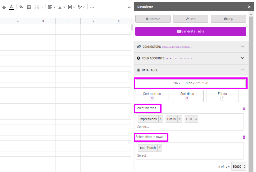
- Once you’re satisfied with your query, click Generar tabla to get your data. Then, add a new sheet, rename it, and repeat the process for your other data sources.
How to refresh your data in Google Sheets
You can do it manually or set a schedule to update the reports to refresh the data you’ve already imported into Google Sheets.
- Ve a Extensions ⇒ Dataslayer, then Refresh all queries o Refresh active sheets.
- And to create an automatic refresh schedule, click Schedule at the top of the Dataslayer sidebar, and select your Refresh time interval, then click Seguro.
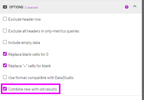
How to import temporal data that do not have historical data in Google Sheets
Bringing temporal data into Google Sheets is often a challenge to many. How do you keep a history of single states in time? Maybe you were collecting real-time metrics that you wanted to keep, how do you save them?
It’s simple, just use Combine new with old in the Options tab in the Dataslayer sidebar to avoid overwriting your old data when you modify, refresh, or schedule your queries. This will ensure that you always keep historical data for all your queries because your data will be accumulated.
Step #3: Build a reporting dashboard in Google Sheets
The fun part: once you’ve gathered all the data you need, it’s time to start building your reports. So, let’s dive in!
How to create cross-platform data visualizations in Google Sheets
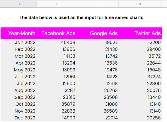
In our example, we will visualize data from three marketing data sources for a virtual company. And for simplicity, we will pick only impressions as our metric for the three sources. So, here’s the process for building cross-platform data tables for our visualizations:
- First, we will create a new sheet to bring all the data we need from the sheets with the sourced data. To do that, we will use the QUERY function for the cross-tab imports. For example, we will bring our impressions column data on the Facebook Ads Data sheet with this syntax =QUERY(‘Facebook Ads Data’!B2:B).
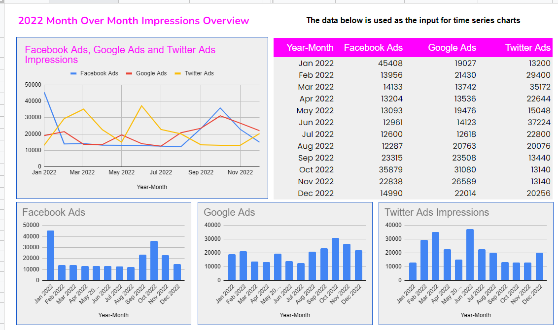
- Next, after we’ve created a table with all the data we need for visualization, our next step is to create charts to represent the data.
- So, go to Insert, then Chart. And on the Charts tab, select your preferred Chart style. For our example, we have used a line chart for all the data and three bar charts for each.
Formatting your Charts
As you’ve seen, formatted charts look much more appealing and align perfectly with your brand scheme. So, formatting your chart into an understandable full-overview dashboard is one of the most important steps for you to take.
And to do that, select the chart area and click the ‘three dots’ at the right corner of your chart area, then edit the chart to open the chart editor panel. Once open, tab on Customize and customize all the chart elements as you see fit.
With these few steps, you can create several charts to fit your needs. That way, you can easily compare different metrics from multiple sources in one place. You can then publish your charts from the three-dot menu at the right corner of your chart area to get a link you can send to others.
Best Practices for Creating a Google Sheets Dashboard
While there’s no one ‘right way’ to create an effective Google Sheets report, following certain best practices has proven to help build better Google Sheets reporting dashboards.
However, certain best practices can take you a few steps closer to developing your perfect Google Sheet dashboard. So, let’s dive into the five best practices that might be useful for creating your reports:
Keep your dashboards simple
As you add more and more visuals to your reporting dashboard in Google Sheets, they can quickly become messy. And while it can be fun to add them to your reports, overdoing it can complicate your dashboard, thus confusing your audience about what’s important.
Use data formats correctly
Picking the right data formats that represent your data accordingly is crucial when creating your reports in Google Sheets, especially for columns that require the user to input the values. For example, ensure that you use the Date or Date Time formats correctly and consistently when referring to dates on your Google Sheets reports.
Use appropriate color schemes
Just like creating complex reports, creating reports with flashy color schemes or inconsistent themes in your reports can also distract your audience from understanding your reports. So, you must pick the right color schemes that clearly show your data or feedback and represent your brand.
Enable data filtering when appropriate
Many of your report audience may require to view different angles of your KPI variables in your reports. Therefore, you can allow your stakeholders to filter and analyze your data based on the criterion they find fit for the data.
Format your report header accordingly
Another Google Sheets best practice is to format your headers accordingly. Your report headers must stand out from the rest of your data so that anyone can notice them easily. You can bold the headers and use title cases to format them. Also, if users have to scroll to reveal their data, freeze it so that it becomes intact as users scroll to reveal the data.
Final thoughts
Analyzing data from several data sources can be challenging. However, with Google Sheets’ powerful features and tools, it is now easier to import data from multiple data sources in a few clicks to create cross-platform reports in Google Sheets.
Marketing reporting makes it easy to understand complex data and make quick business decisions for your company. And to make accurate and effective reports, you need efficient tools like Dataslayer para Google Sheets for fast and seamless data collection processes.
We hope this article has helped you understand how to source your data from multiple data sources and build cross-platform marketing reports in Google Sheets. Also, we’ve discussed the five best practices for creating effective Google Sheets reporting dashboards.