


Para que su negocio crezca, debe intentar ver y comparar la evolución de sus campañas de marketing o publicidad a lo largo del tiempo en Looker Studio. Esto se debe a que comparar su rendimiento de marketing a lo largo del tiempo le permite identificar áreas de mejora, a medida que encuentra más tácticas para optimizar sus futuras campañas.
Medir la efectividad de su campaña de marketing a nivel de campaña es crucial para identificar los factores principales que impactan su estrategia, como un aumento en el costo por lead o una caída repentina en el tráfico. Sin embargo, comprender cómo se comparan sus campañas a lo largo del tiempo le ayuda a detectar insights más profundos y tendencias valiosas que pueden maximizar el impacto de sus campañas.
Y por eso, hoy, vamos a profundizar en cómo puede ver y comparar la evolución de sus campañas de marketing durante el año en Looker Studio (Google Data Studio). Discutiremos las fórmulas personalizadas para unir varias fuentes de datos a través de la mezcla y la comparación utilizando la función de rangos de fechas.
¡Así que, vamos a sumergirnos!
Cómo importar, ver y comparar todos los datos de sus campañas de marketing en Looker Studio
Para comparar la evolución de sus campañas de marketing durante el año, o periódicamente en Looker Studio, hay dos opciones: mezclar sus datos y comparar o usar un rango de datos de comparación. Así que profundizaremos en cómo importar sus datos, mezclarlos y luego, compararlos en Looker Studio.
Cómo importar sus datos de marketing y crear informes en Looker Studio
Para construir un nuevo informe de comparación, primero debes recoger tus datos de tus plataformas de marketing. Looker Studio proporciona conectores a numerosas fuentes de datos, y también hay un par de fuentes de datos de la comunidad para ayudarte a obtener todos tus datos en la plataforma.
Así que, aquí está el proceso para importar tus datos de tus fuentes de marketing:
- Inicia sesión en Looker Studio.
- Clic Crear en la esquina superior izquierda del panel de Looker, luego Fuente de datos.

- A continuación, elige tu fuente de datos de marketing preferida y autoriza a Looker Studio a obtener los datos de allí. Luego, haz clic Conectar para usarlo en tus informes.
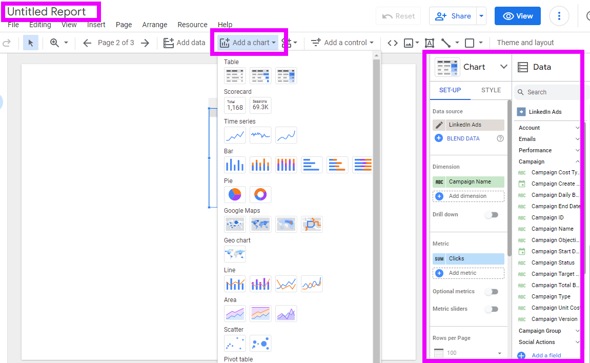
- Una vez que lo autorices y conectes, puedes ajustar los parámetros como consideres necesario para tus necesidades. Aquí hay un ejemplo de cómo conectar Looker Studio a los datos de LinkedIn Ads a través del conector de LinkedIn Ads de Dataslayer.
- A continuación, crea un nuevo informe para visualizar tus datos. Y para hacerlo, haz clic Informe en blanco o Crear entonces Informe en la parte superior izquierda de tu panel.
- A continuación, haz clic en Agregar Datos y conéctate a nuevas fuentes de datos si aún no las has agregado, o toca en Mis Fuentes de Datos para utilizar tus fuentes de datos conectadas anteriormente.


Nota:
- El proceso para conectar tus fuentes de datos es similar para todos nuestros conectores, así como para muchos otros en Looker Studio. Así que sigue este proceso para llevar todos tus otros datos a Looker Studio.
- Puedes hacer esto para todas tus otras fuentes de datos para usarlas en tu informe.
Cómo visualizar las comparaciones de tus datos en Looker Studio
Hay diferentes formas de visualizar tus datos en Looker Studio. En este ejemplo, exploraremos cómo puedes usar tablas con mapas de calor para ver tus datos periódicamente en Looker Studio. Una vez que hayas agregado todas tus fuentes de datos a tu informe, como hicimos en los últimos pasos, ahora es el momento de visualizar y hacer comparaciones simples de tus datos. Así que, vamos a sumergirnos.
- Para agregar un gráfico para visualizar tus datos en Looker Studio, ve a Agregar Gráfico. Luego, elige un gráfico para visualizar tus datos. Aquí, elegimos la Tabla con mapa de calor del menú desplegable de agregar gráfico, que utilizó automáticamente el Nombre de la campaña como una dimensión y Clics como una métrica de nuestra fuente de datos.

Nota: Puedes elegir cualquier gráfico para satisfacer tus necesidades de comparación de datos.
- Sin embargo, por simplicidad, necesitaremos comparar los datos según la fecha. Así que, eliminaremos el nombre de la campaña como una dimensión y agregaremos Año-Mes de nuestro conjunto de datos. Diferentes fuentes de datos utilizan diferentes formatos para las fechas. Y dependiendo de tus necesidades, debes configurarlos para que los valores sean los mismos para todas nuestras fuentes de datos.
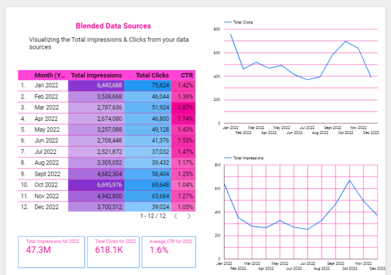
- Aquí hay un ejemplo de dos fuentes de datos que hemos traído a nuestro informe. Creamos dos tablas con mapas de calor para representar nuestros datos de cada fuente de datos. Estas tablas representan las impresiones y clics mensuales de las dos campañas de marketing diferentes.


Cómo mezclar y comparar datos de diferentes fuentes en Looker Studio
Si tienes varias campañas de marketing de diferentes canales, traerlas todas a tu informe no es suficiente para que compares de manera eficiente la evolución de tus campañas de marketing. ¿Cómo encuentras una manera de combinar todos estos datos en un solo gráfico que te muestre tu rendimiento general de forma rápida y precisa?
Ahí es donde la mezcla de datos viene a tu ayuda. Por ejemplo, ¿qué pasaría si quisieras ver el total de impresiones de anuncios y clics en todos tus canales de marketing para calcular tus tasas de conversión mensuales generales? Hay varias formas de crear una fuente de datos mezclada en Looker Studio, y aquí está la forma más sencilla de hacerlo:
- Desde los gráficos que creamos arriba, selecciona todos ellos, haz clic derecho y selecciona Mezclar datos en la parte inferior del menú contextual.
- Instantáneamente, Looker Studio creará un nuevo gráfico basado en tus fuentes de datos. Si no tienes dimensiones y métricas complejas en tus gráficos, es posible que obtengas un gráfico limpio que no requiera más configuración.
- Sin embargo, si el gráfico resultante necesita algunos ajustes, revisa la columna de datos y utiliza las dimensiones y métricas correctas de tu fuente de datos mezclada. Puedes usar estos datos para crear otros gráficos personalizados, como crear nuevos campos para calcular totales, tasas de clics, y más.

Leer más: Anteriormente, escribimos un artículo sobre las limitaciones de la mezcla de datos en Looker Studio, y cómo superarlas.Así que asegúrate de revisar ese artículo.
Cómo comparar los datos de tus campañas de marketing utilizando la función de comparación de fechas
Supongamos que quieres comparar los datos de tus campañas de marketing de la semana pasada con los de la semana anterior. O quizás quieras comparar los datos de mayo del año pasado con los de mayo del año anterior. ¿Cómo puedes hacerlo?
Para construir informes que muestren al lector cómo se compara el rendimiento de un cierto período con otro, utiliza el Comparar opción en el selector de rango de fechas. Puedes usar tablas o tarjetas de puntuación y flechas codificadas por colores para mostrar la dirección de los cambios (delta).
Para crear informes como este, aquí te explicamos cómo hacerlo:
- Desde tu informe, elige el gráfico que deseas comparar y haz clic en la flecha hacia abajo en el botón de control de rango de fechas en la esquina superior de tu espacio de trabajo del informe. Si no puedes encontrar un control de fecha en tu informe, añade uno desde los controles en el menú.
- A continuación, haz clic en el interruptor de comparación en el menú desplegable y selecciona un período de comparación. Este período puede ser el predeterminado, el año anterior o un rango de fechas personalizado.
- Una vez que selecciones el rango de fechas que deseas comparar, haz clic en Aplicar. Cuando presiones Aplicar, tu gráfico se actualizará para incluir datos de tu rango de fechas seleccionado. Puedes hacer clic en las flechas dobles en tu gráfico para ampliar tu comparación e incluir métricas de comparación completas en tu gráfico.
¡Y ahí lo tienes! ¡Comparación clara de tus datos de marketing!
Cómo segmentar tus datos por tiempo
Si tu fuente de datos solo proporciona la fecha y la hora para tus dimensiones, debes configurar esta fecha para ayudarte a obtener una vista granular de tus datos. Para segmentar tus datos según las fechas, por ejemplo, diario, semanal, mensual, trimestral, etc., con Looker Studio, es mucho más posible.
Para hacerlo, debes editar el formato de fecha de tu fuente de datos para que coincida con tus preferencias. Así que, haz clic en tu gráfico, luego en las propiedades, y haz clic en el botón de editar en tu dimensión con una dimensión de fecha. En el submenú que aparece, cambia el tipo de dato a los períodos que desees.

Por ejemplo, si desglosaste tus datos utilizando el año, puedes cambiar el tipo de fecha a Año mes para segmentar tus datos en datos mensuales. Así, en lugar de obtener una comparación anual general, obtendrás comparaciones para cada mes de los años. Y así, en lugar de una fila para el año, ahora tendrás 12 filas para cada mes del año seleccionado.
Mejores prácticas y consejos para crear tableros de comparación de marketing efectivos en Looker Studio
Para crear los mejores informes que comuniquen el mensaje correcto a tu equipo y partes interesadas, debes seguir las siguientes cinco mejores prácticas y consejos para crear tableros efectivos para tus campañas de marketing.
Incluye títulos, subtítulos y contexto
Agregar gráficos a Looker Studio no es la única tarea que puedes hacer para crear los mejores informes para tus datos. Además, debes incluir la información relevante sobre tus gráficos antes de seleccionar tus fuentes de datos, dimensiones, métricas y rangos de fechas para poblar tu visualización.
De esa manera, facilitas que los usuarios sepan de qué trata tu gráfico. Así que, agrega títulos a tus visualizaciones de datos de comparación. Además, agrega subtítulos, leyendas y microcopias para proporcionar contexto adicional a tus informes. También incluye información que no está en tus gráficos, como las fuentes de datos utilizadas, los rangos de fechas, etc.
Utiliza KPI scorecards en tus informes
Los Indicadores Clave de Rendimiento (KPIs) esenciales que debes rastrear en tus campañas de marketing son las características más valiosas que debes incluir en tus dashboards. Debes incluirlos en áreas prominentes de tus informes para mostrar que estas métricas tienen una mayor prioridad.
Los KPIs incluyen todas las métricas de crecimiento que puedes usar en tus dashboards para contar la evolución de tu marketing a lo largo del tiempo, como las tasas de clics (CTR), el retorno de la inversión publicitaria (ROAS), el volumen de leads, etc. Para agregar un scorecard de KPI en Looker Studio, ve a Gráfico y luego a Scorecard.
En la sección de métricas del Panel de Configuración, elige un KPI y repite el proceso según sea necesario. Finalmente, ve al Panel de Estilo y personaliza el tamaño y formato de tu scorecard.
Compara tus objetivos con tus logros
Tener objetivos para todas tus campañas de marketing puede ayudarte a dirigir tus esfuerzos de manera eficiente. Sin embargo, comparar tus objetivos anteriores con los resultados es una forma de identificar si hay necesidad de mejora.
Ya sea que tus interesados estén preguntando si estás alcanzando tus objetivos de marketing o no, debes mostrarlo claramente en tus dashboards. Mientras que los objetivos y metas de la mayoría de tus campañas de marketing no están estandarizados, las opciones de comparación tampoco lo están. Por lo tanto, para usar un gráfico de comparación en Looker, debes usar un gráfico con comparación, como un bullet o gauge, y luego agregar un campo calculado con el progreso hacia el objetivo.
Lleva todos tus datos de marketing a Looker Studio con Dataslayer y compáralos de manera eficiente.
Para concluir, comparar todos tus datos de marketing en Looker Studio permite a tus lectores saber si las cosas están mejorando o necesitan mejorar a lo largo del tiempo. Es decir, crear dashboards que cuenten la historia de cómo han estado rindiendo tus datos de marketing a lo largo del tiempo es una de las funciones más importantes de la visualización de datos.
Y así, para hacer eso, debes recopilar y comparar tus datos de marketing en una herramienta de visualización de datos, como Looker Studio. Puedes usar conectores de Dataslayer para Looker Studio importar tus datos de marketing favoritos para comparación y visualización en Looker. Dataslayer tiene más de 40 fuentes de datos diferentes para ayudarte a llevar tus datos de manera eficiente. Y cuando puedes llevar todos tus datos a Google Data Studio, se vuelve más fácil ver las tendencias y comparaciones históricas de tus campañas de marketing a través de tus canales de marketing digital.


