You have a vast amount of data at your disposal, but making sense of it feels like a challenge. Data visualization tools promise to simplify the process, yet with so many choices available, selecting the right one can be daunting. Looker Studio, Power BI, and Tableau are three of the most popular data visualization tools, but which one is best for your business?
In this article, we’ll compare these tools based on key factors like ease of use, features, pricing, and integration to help you make an informed decision.
Why Choosing the Right Data Visualization Tools Matters
Data is the backbone of decision-making in any company. However, raw data is meaningless without proper visualization. The right tool can:
- Make complex data easy to understand.
- Improve decision-making based on insights.
- Save time by automating reports and dashboards.
- Integrate seamlessly with other data sources.
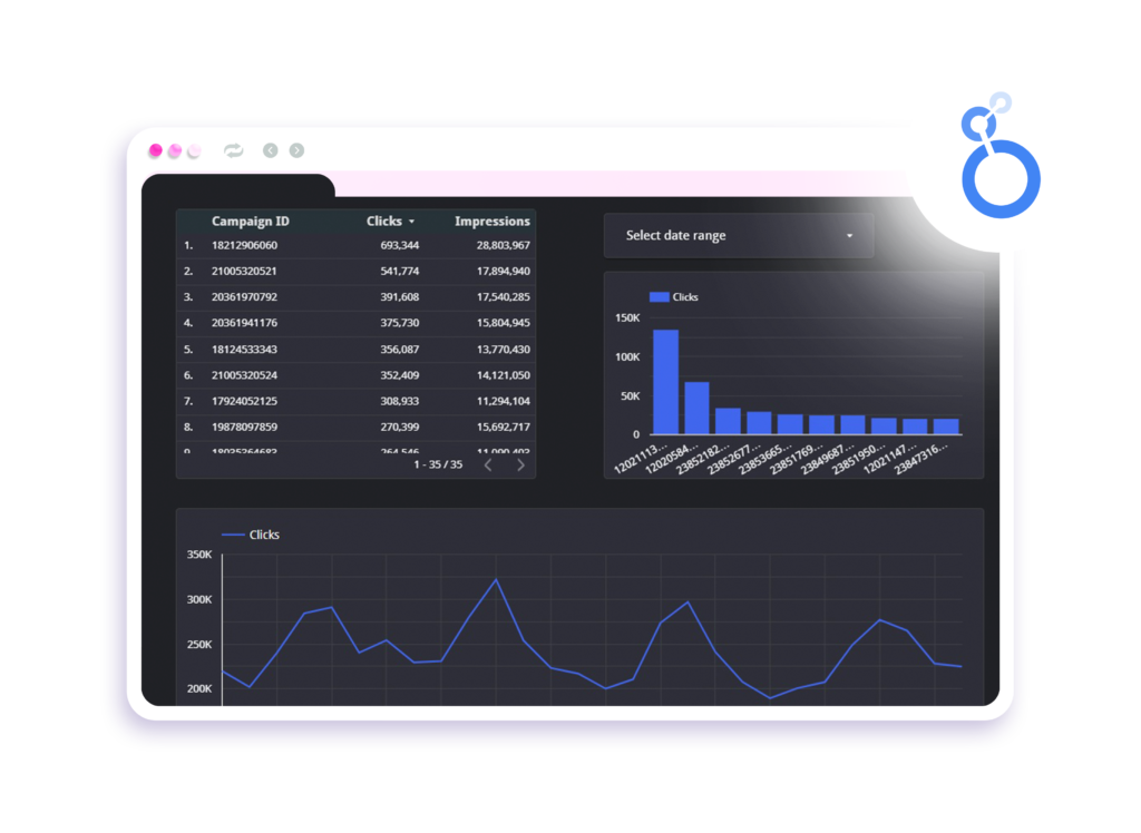
If you’re looking to streamline your data reporting process even further, tools like Dataslayer can automate data extraction for Looker Studio, Power BI, and Tableau. This eliminates the hassle of manual data transfers, reduces errors, and ensures real-time updates, allowing you to focus on analysis rather than data wrangling. Now, let’s dive into our comparison.
Overview of Looker Studio, Power BI, and Tableau
Looker Studio
Looker Studio is a free tool designed for businesses that need simple yet effective data visualization. It integrates seamlessly with Google products like Google Analytics, BigQuery, and Google Sheets, making it ideal for digital marketers and small businesses.
Pros:
- Completely free to use.
- Easy integration with Google services.
- Cloud-based and requires no installation.
Cons:
- Limited advanced analytics features.
- Can be slow with large datasets.
Power BI

Microsoft Power BI is a business intelligence tool that offers advanced data analytics and visualization. It is widely used by enterprises that need deep data analysis and integration with Microsoft products.
Pros:
- Strong AI-powered insights.
- Excellent integration with Microsoft tools (Excel, Azure, etc.).
- Affordable pricing for small teams.
Cons:
- Steeper learning curve.
- The free version has limitations on data refresh rates.
Tableau

Tableau is one of the most powerful data visualization tools available, known for its deep analytics capabilities and beautiful visualizations. It is best suited for data analysts and larger enterprises.
Data Visualization Tools Pros:
- Advanced analytics and AI-driven insights.
- Interactive and high-quality visualizations.
- Can handle massive datasets efficiently.
Data Visualization Tools Cons:
- Expensive compared to other options.
- Requires training to master.
Key Comparison Factors of the Data Visualization Tools
1. Ease of Use
- Looker Studio: Very beginner-friendly, ideal for marketers and small businesses.
- Power BI: Moderate learning curve; familiarity with Excel helps.
- Tableau: Requires training but offers powerful capabilities.
2. Features and Functionality
- Looker Studio: Best for simple reports and dashboards.
- Power BI: Stronger in AI-powered analytics and business intelligence.
- Tableau: Best for in-depth data analysis and high-quality visualizations.
3. Pricing
- Looker Studio: Free.
- Power BI: Starts at $10 per user/month (Pro version). Free and enterprise versions are available.
- Tableau: Starts at $15 per user/month (Tableau Viewer), other plans cost more.
4. Integration
- Looker Studio: Best for Google products.
- Power BI: Best for Microsoft ecosystem.
- Tableau: Works well with multiple data sources, including cloud and on-premise.
Which Data Visualization Tools Should You Choose?

- Choose Looker Studio if you need a free, simple tool for Google-related data visualization.
- Choose Power BI if your business already uses Microsoft products and needs advanced analytics at an affordable price.
- Choose Tableau if you require deep data analysis, interactive dashboards, and have the budget for a premium tool.
Final Thoughts Of Data Visualization Tools
The best data visualization tools depends on your needs. If you’re just starting, Looker Studio is a great free option. If you need a balance between affordability and power, Power BI is a strong choice. For businesses that demand the best analytics and visualization capabilities, Tableau is the way to go.
Now that you have a better understanding, which tool do you think suits your business best?